I was thinking about how time consuming imagery has been in the past, but when doing it in bulk, I’ve found a system that makes it a snap to get a great featured image for all my posts.
Maybe you don’t have to redo all your images, but going forward, you can shave off a lot of time by following this method.
Determine the best size for your featured image
Every social platform has a different size {so annoying}, but in general, if you ctime-consuming that’s at least 1000px wide, it’ll showcase nicely in most places. You can always resize and crop the image for a specific platform later.
The other factor to consider is your theme. If you have a carousel or featured slider, you need to make your featured images fit that slot. This is one of the reasons I don’t like them, because often the slider size is not conducive to social media and you end up needing several images, or risk it looking awkward on social.
I’ve chosen 1000 pixels wide by 1200 pixels tall. You’ll be creating a template in either Photoshop or Canva. Canva is great for beginners and it’s free!
Design your template
When creating a featured image template, you want to think about the kind of website you have. If you create a template too specific for a particular post, it won’t be of use to you down the road. The trick is to create something uniquely you, and yet, broad enough that it can work for any type of post. These are things you’ll want to include on your template:
- Your website name and/or watermark
- At most – 2 fonts that will remain the same each time you make an image – even better if the font matches your logo or complements it
- Your branded colors – write down the six digit codes so you have them handy
I really like the look of high-res photos as a background – either blurred out, black and white, or lightened up – even if you write about something that’s not typically showcased in photography {like my website for example} you can still make it work. But you can also do a graphic or cartoon as your background. Take a look at the difference between a photo background vs. digital graphics or solid colors.
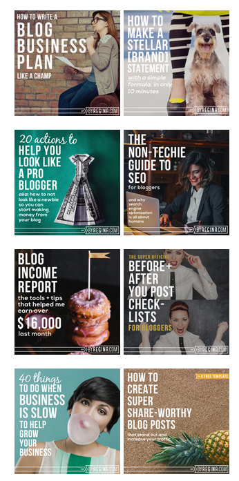
ByRegina uses photos that don’t necessarily go with the topic at hand, and yet, she makes it work beautifully.
Rebekah Radice is a good example of a blogger that uses graphics and cartoons, rather than photos. She has her signature orange, and a vector animation of a woman that appears in various places.


How to pick out a photo
If you’ve decided to have a photo background {and don’t take your own photos}, follow these tips:
- Choose one that’s very high resolution and blow it up so we only see a portion of it.
- Use one word in your title for your photo search. For example, for my MailChimp tutorial, I knew there’d be no photos of MailChimp, so I did a search for photos using the word mail. The same goes for posts about social sharing. I just looked up the word share or tried to find pictures of crowds of people. Your photo can be loosely associated with the topic, and that’s okay.
- In Canva, you can use the photo filters to turn it black and white or add different tones so it’s easier to read your text overlay.
- Try to find a photo that has a spot that’s more empty where it’s easy to put the words on top of it.
- If you’d rather not deal with text over an image, design your template with a solid block of color where the title can go instead. See Peg Fitzpatrick as an example.
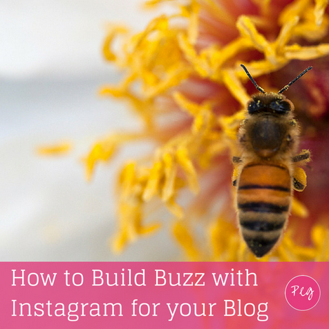
Deconstructing A Featured Image Template
- I start with a canvas that’s 1000px by 1200px.
- I created a pink strip at the bottom to put the CYLL name.
Next, I write the title of the post and place it left justified. You can always rearrange the text to fit the photo on a per post basis. I could have also added a few splashes of pink – just to add fun to the image. The point is that I want any image on social media to reflect branding and color scheme so it’s immediately recognizable.
The last step is to find a photo and put it on the background. Now, I could revert to digital graphics, but since I want all my images to look similar, I need to think outside the box and find a photo that could work.
I decided to do a search for “numbers” to see what I could find and this photo came up.
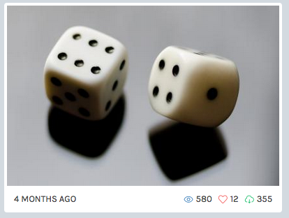
Watch what happens when I blow it up, add a filter, and crop some of the photo out.

Once you have your template, save it so you can come back to it again and again. Each time I need a new featured image, all I have to do is add the image and change the text on the title. It takes approximately 3 minutes!
How to install your featured image
Every theme is different, but in most cases, you’ll see a box on the right side of the edit screen in your dashboard. It’ll have a blue link that says SET FEATURED IMAGE. This won’t put the photo in the post {necessarily}, but it will be the photo that displays when people share your content across the web.
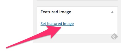
For my theme (Genesis), I set the featured image and then I also upload it into the beginning of the post. That way, people have an easy pinnable image they can grab when sharing my content.
The takeaway
Having a cohesive look that is instantly recognizable is very important and now you can save loads of time by creating your own featured image templates. All in all, I spent an hour to set it up and then populating the featured images took minutes at most.
The key takeaways I think that will help are as follows:
- Don’t be afraid to use a photo that isn’t directly related to the content. When you blow it up and add filters, it still can look good. In other words, don’t be so literal.
- Stick with your branded colors and fonts. No more than two fonts!!
- Build your image template at a size that will look reasonably good on all platforms, since many of us don’t have time to create specific images per platform.
- If you are going to use a graphic template, make sure the main graphic is a good one! Otherwise, it will look cheesy.
- Consider uploading the photo into the post after you’ve made it the featured image so that people can easily pin the image
If you are want to redo all your images, I recommend that you start with all the latest posts on your homepage. Then, use your google analytics or jetpack stats to see what posts are the most popular. Then set to work on editing those. Finally, you can go through and recreate the other featured images when you have the time. The benefit is once the image is made, you can re-share the post on social media!
