If you’re a blogger, you know that with the start of 2015 comes the unfortunate reality that Facebook will be showing your posts to no one unless you pay. As experts like Neil Patel and others have reiterated over and over, email subscribers are the best and most efficient way to get and keep readers. So to start off the year right, I’m going to dive into MailChimp – an easy and free program for email newsletters and blog posts. I have a table of contents below or if you are the pinning type, click here for the pin!
- How to Create a List
- List Management
- What’s a Campaign?
- How to Create an Email Template
- Sign Up Form Customization
- Tips and Tricks You May Not Know
Before we get started…
Are you a visual learner? Do you want to have a complete Mailchimp course that shows you exactly how to do everything you need to know including:
- How to set up your list with groups and segments so that you aren’t paying for duplicate email addresses on several lists?
- How to integrate Mailchimp onto your WordPress website with opt-ins on your sidebar so you can build your list quickly?
- How to customize your stand-alone Mailchimp form and add it to your Facebook business page?
- How to customize your thank you pages and final welcome email to entice subscribers to read and buy?
- How to integrate Mailchimp with SumoMe, Zapier, Paypal, plus where to find your API key and various ways you can create integrations with your lists?
- How to set up automation workflows based on what links are clicked on in your emails?
- How to master Mailchimp from A-Z?
Awesome. Because in addition to this 3000+ word blog post, I have a course for sale that will pull it all together for you, and give you the skillz you need to wrangle the Mailchimp Monkey.
You can enroll right here!
Now on to the written tutorial….
How to Create a List
Your list is where all the email addresses reside. You can have multiple lists in Mailchimp, or you can have one that you segment into pieces and parts if you wish. For most basic bloggers, one email list will suffice. To create a list is simple.
1. Log into MailChimp.
2. Click on Lists.
3. Click on Create List in the top righthand corner.
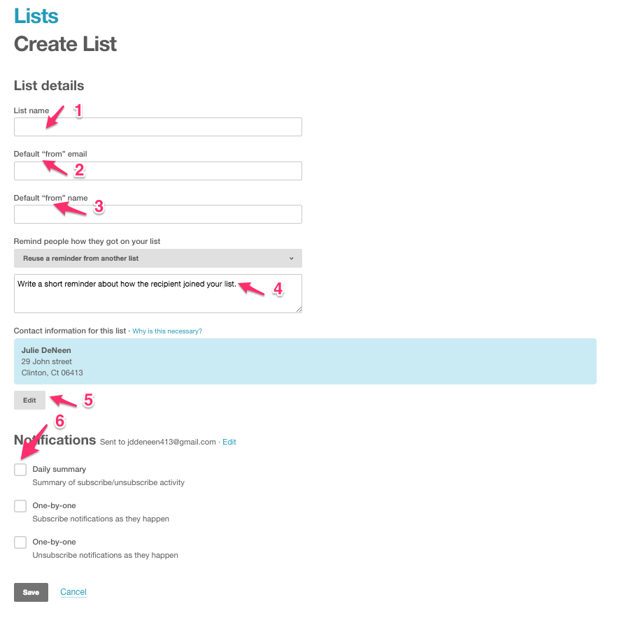
1. List Name: This is just for your list management purposes. You can call it “My Blog Subscribers”.
2. Default From Email: It’s important NOT to use an AOL or YAHOO address. Use a GMAIL one, or even better, a custom one (i.e. Julie@fabulousblogging.com)
3. Default From Name: This can be your name– first and last — or your blog name. It’s who the email will be from when it arrives in the person’s inbox.
4. Reminder: An easy explanation is to say something like, “You signed up to receive new posts by email on http://yourblog.com.
5. Address: Unfortunately, the law requires an address, so if you aren’t comfortable using your home address, you’ll need to get a P.O. Box.
6. Notifications: I opt out of notifications altogether, but if you want updates, a daily summary should be plenty. The idea is you want lots of subscribers and if you get emails every time, your inbox will be flooded.
List Management
Once your list is created, all new email signups through your blog, by importing, or by manual entry will be there. To get to your list, you simply have to click on Lists from the dashboard, and then click on your list name.
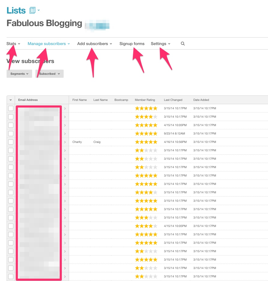
1. Stats: Try not to obsess about stats, but if you need to know how many people are using Gmail vs. Yahoo for example, what countries they are in, or how often they are opening your emails, the stats area is where to find it.
2. Manage Subscribers: Here you can create a segment of a list. Let’s say you have a few new people that you want to send a welcome newsletter to (and not just your weekly posts). Creating a segment allows you to not have to create an entire new list.
Click on SEGMENTS, and then click CREATE NEW SEGMENT in the top right. Then you have to set parameters for your group. You can filter email addresses manually or do it based on date, location, etc.
Groups are also a handy tool. When I was running my beta bootcamp, I had 60 email addresses in a special group. Click on GROUPS, and click CREATE NEW GROUP in the top right.
Make sure you specify if you want people to see it on their sign up form, or if you want it private. A good reason to have it public would be if you want to give your subscribers a choice (email me every time there is a new post, email me once a week, email me once a month). You can create three separate groups and allow them to choose when they sign up. Otherwise if it’s private, you’ll have to go through your addresses and add certain ones to the group you just created.
3. Add Subscribers: You can manually add an address by typing it in, or you can import subscribers with a CSV file from another subscription service (Jetpack for example).
4. Sign Up Forms: We’ll cover this more extensively in another section of this post. This is where you create all the sign up forms you want to use for your blog.
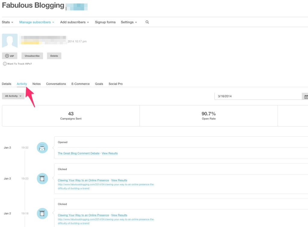
5. Settings: If you want to change any of the settings (like email address, from name, etc.) this is where you do it. If you want to get crazy, you can click on any email address, and see all their activity.
What’s a Campaign?
A campaign is just a fancy term for email or newsletter. Once you have your list, you’ll want to send emails out to them when you publish a new post. Or you may just want to send a weekly/monthly newsletter. There is a way to do an RSS driven campaign, which means the email is automatically sent out when the post is published. I’m not going to discuss RSS driven campaigns in this post, but here is a resource if that’s the way you want to go.
Setting up your email campaign
Chances are you’ll want to send a branded email each time – without changing it too much. We’ll create an email template shortly that you can use each time you go in to send out an email. For now, click on Campaigns and it’ll show you every email you’ve sent (if you’re just starting, it’ll be blank). Click on Create Campaign in the top right to get started. 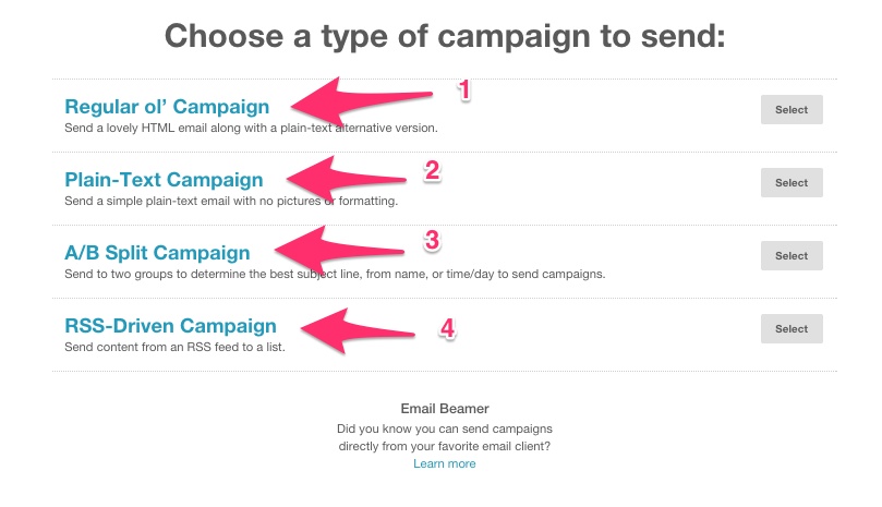
1. Regular Ol’ Campaign: This is the one you’ll use most often.
2. Plain-Text Campaign: This will display NO images. It’ll just be text. The benefit is that it’ll probably not go to a promo filter in Gmail for example, but it’s meant for short and sweet announcements.
3. A/B Campaign: This is just like the regular campaign except it’ll separate your list into batches.
4. RSS-Driven Campaign: This is the auto-campaign I talked about before and will require you to understand merge tags to set up.
If you choose Regular Ol’ Campaign, it’ll ask you what list you want to use. This is where you can send to a segment of a list. When you click on the list, it’ll ask if you want to send it to them all or to a segment.
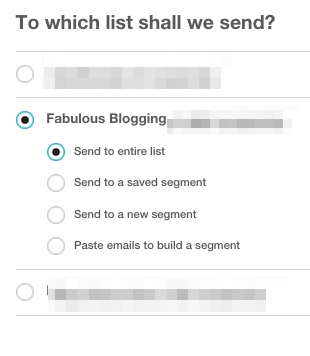
Choose your list and then hit next. By the way, all your navigational buttons now will be at the bottom, and you’ll see a menu as well. You can click on any of these at any time to go back and forth between windows. Your settings automatically save.

The next screen is the campaign info.
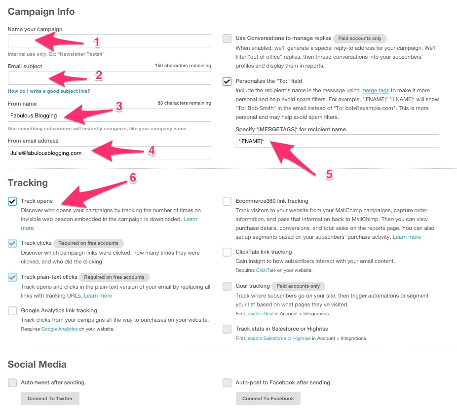
1. Name: This is for your reference only.
2. Email Subject: The MOST IMPORTANT PART of your whole campaign. Your subject line should be short, provocative, and engaging.
3. From Name: Your name or your blog name.
4. From Email Address: Here you can specify a different email address than the one you used when you set up your list, but make sure you’ve verified it in your account first. Otherwise, it’ll pull the default email you used during setup.
5. Recipient Name: This will personalize the email to the reader. Just leave as is.
6. Track Opens: This will allow you to see who actually opened the email.
Click Next. Now you’ll have the option to choose a template.
We’ll be creating one in a minute, but you can choose from pre-made themes, or you can use an old campaign and simply copy it.
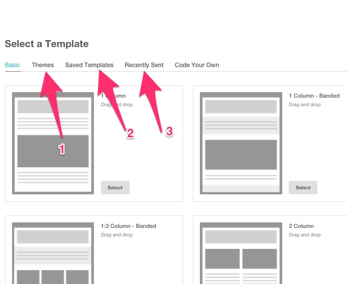
1. Themes: Pre-made for you to customize further.
2. Saved Templates: What we’re going to do next.
3. Recently Sent: Simply use an old email to copy. You can of course, click on any of the templates visualized below.
Once you have one, click Next.
Now you’ll be in the design mode.
Once you’ve made your email as you like it, click next and you’ll be asked if you want to edit anything further before you send it out. You can edit anything you want before it goes out. And if you want to schedule it, when you’re on the confirm tab, there will be a button that says “Schedule”.
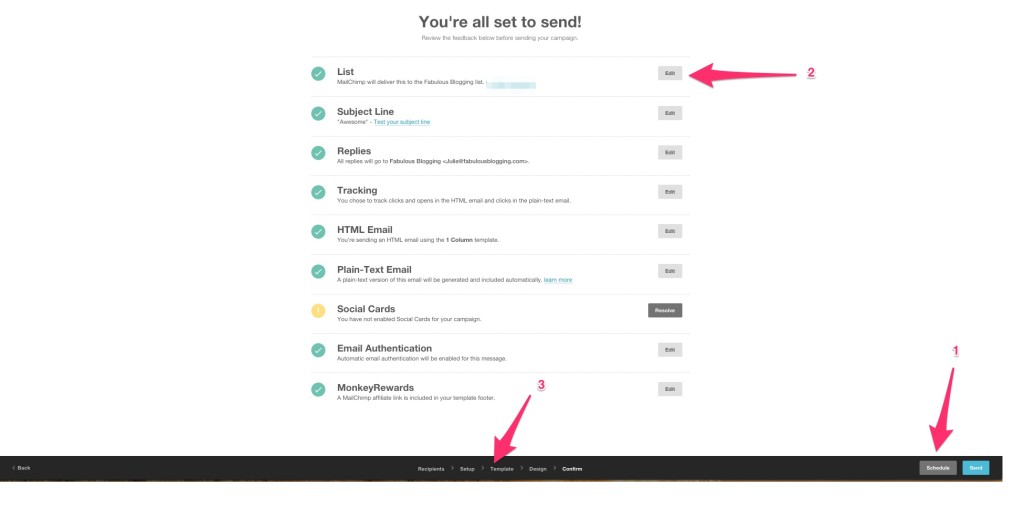
1. Schedule: Send your campaign at a later date and time.
2. Edit: This allows you to go back and fix anything you need to.
3. Menu: You can also use the menu to go backwards. Everything is saved, don’t worry!
How to Create an Email Template
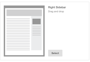
Now we’ll tackle the design area of MailChimp. Whether you are making a one-time email or a template, you’ll be following the same process. On your dashboard (to get to your dashboard at any time, click on the Monkey Head in the top left), click TEMPLATES. Click Create New Template in the top righthand part of the screen. You’ll end up on the screen with all the different layouts. For today, I’m going to use a basic blog template with a simple sidebar. I find that when I give my readers too many choices, they choose nothing. Select the one that says RIGHT SIDEBAR.
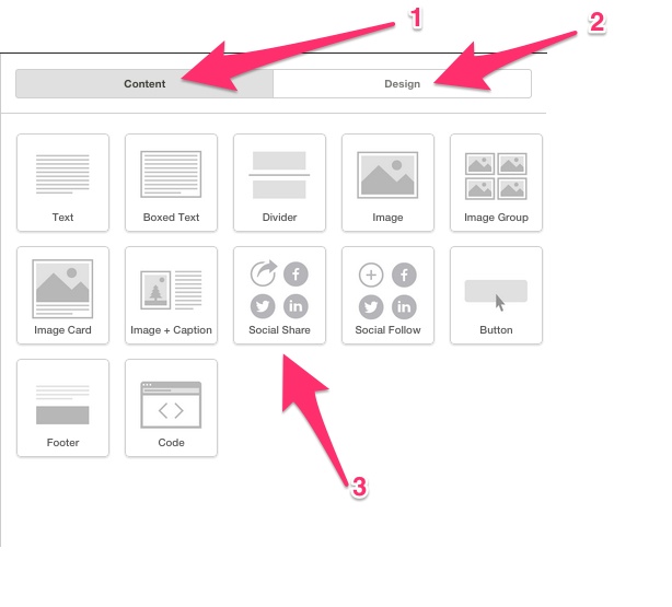
Explaining the right hand side menu
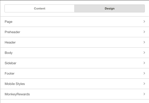
1. Content: This is the main design option menu that opens up. You can choose any kind of element you want and drag it over to the left into your template.
2. Design: If you click Design, you’re going to see where you can customize the general look of the email.
3. Social Share: This is just an example of an element. Below I show you how many options there are for EACH ELEMENT. 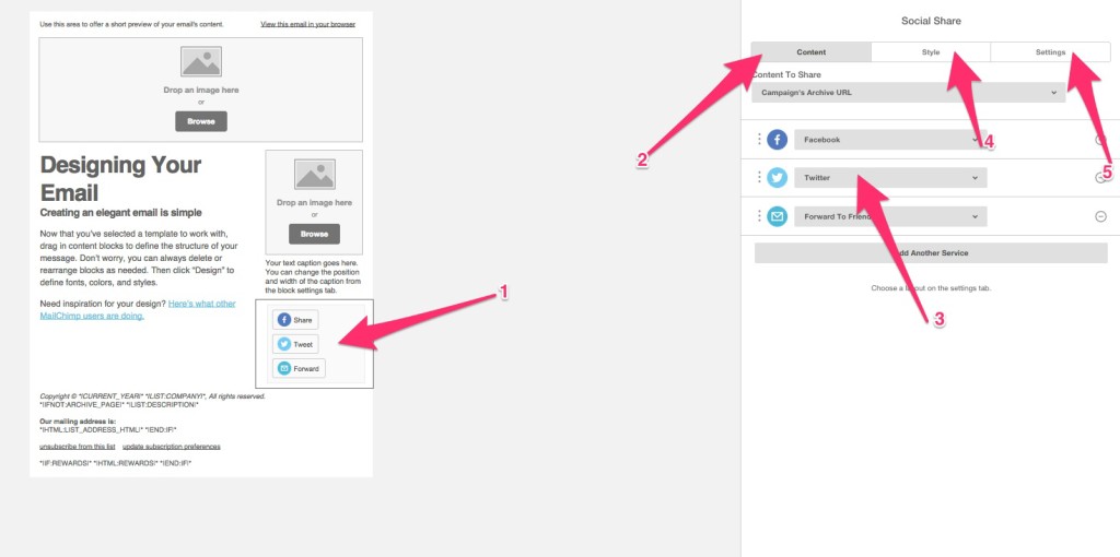
1. When I dragged the social share over to the template, it popped open.
2. Content is the main area that stays open for the particular element you are working with.
3. Here I can specify what I want each button to do by clicking on it. Just use the little arrow. For this element, all you can do is change the type of button you want to use.
4. If I click on Style, it will allow me to customize how the element displays.
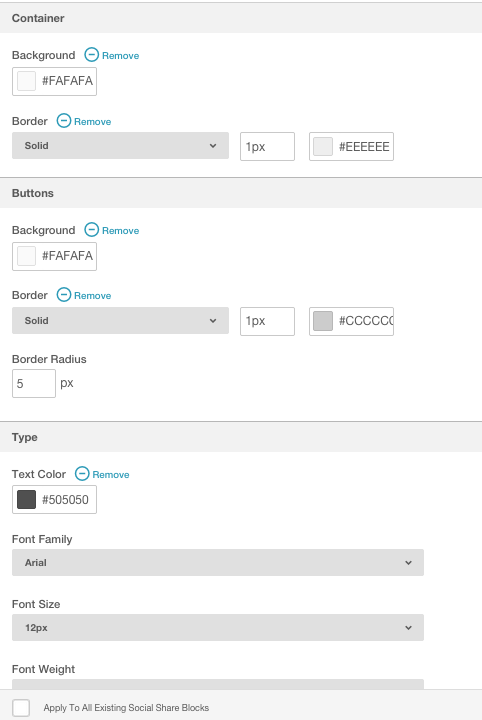
5. Settings gives me alignment options, layout options, etc.
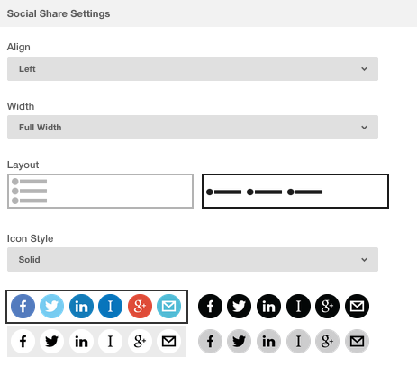
To go back to the main design menu, hit the save and close button at the bottom.
Element Options
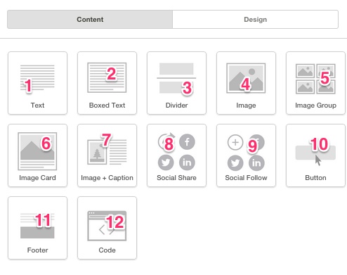
1. Text is for your main content.
2. Boxed text just adds some style around your text.
3. Dividers are stylistic elements to break up the different areas of your email.
4. Image is for an image.
5. Image group will allow you to put several images together in a grid-like shape.
6. Image card is more like an image with a caption.
7. Image + Caption allows you to put the caption to the left or the right of the image.
8. Social share is for people to share your email on social media.
9. Social follow is so people can click over to your social profiles and follow you.
10. A button is a great way to get people to click.
11. Footer is for the bottom of your email.
12. Code allows you to add your own HTML for complete control.
Understanding the template on the left
When you click and drag something over, you’ll see that their are blue outlines asking you where to drop it. There are also predefined elements that were there because of the template we chose at the beginning. By clicking on any part of the template, you can modify what’s there, copy it, or delete it. 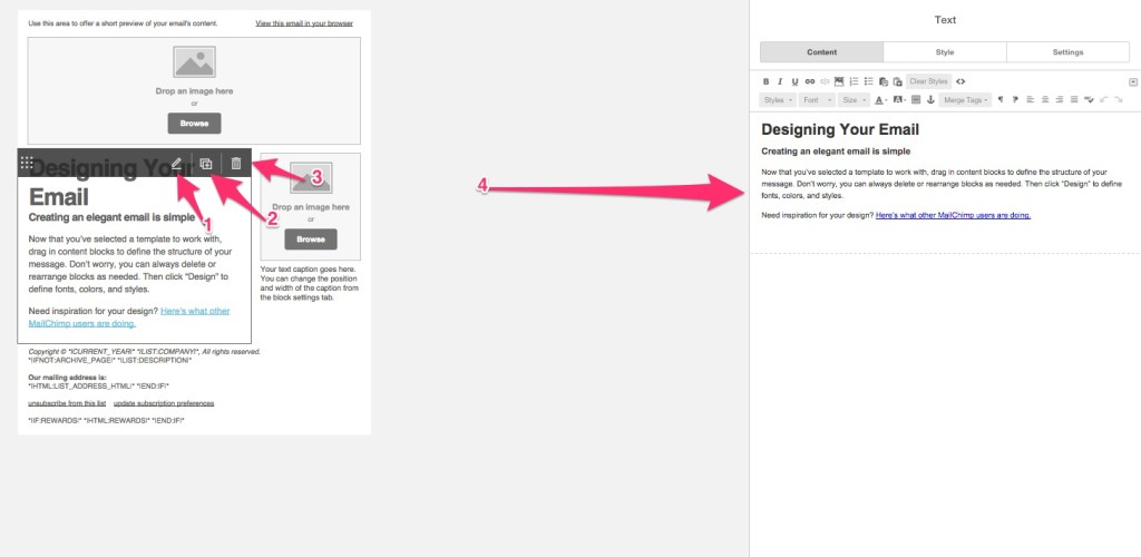
1. You can edit the template area by clicking on the pencil.
2. You can copy it so it repeats again right below the element.
3. You can delete the element.
4. Notice what happened when I clicked on the pencil? The main menu disappeared and now I have a whole new set of options available. Clicking on Style or Settings on the top right will give me even more options for JUST this element. Hitting save and close at the bottom brings you back to the main menu.
Just to summarize, this happens when I click and drag an element over to the left like so.
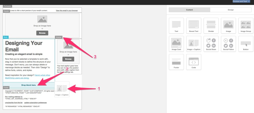
1. The drag of the element from the right to the left.
2. The blue lights up to show you where it’s going to land.
3. The little labels show you the different parts of the template.
Making my Template Step by Step
1. First, I added a teaser at the very top.
2. Then, I added an image to the header area. When I have that element highlighted, I can adjust the options. Notice when I click on settings, I can change the alignment of my logo so it displays in the center.
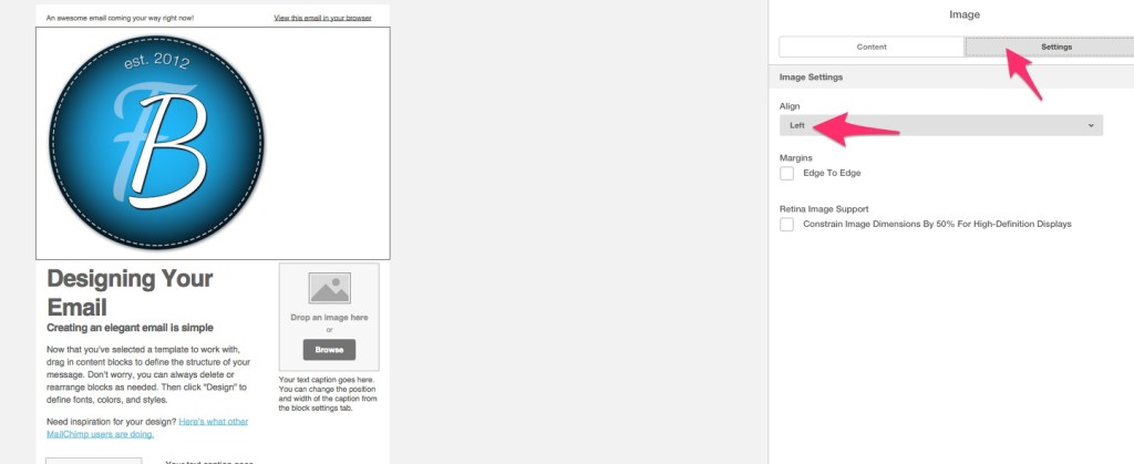
3. If I want to make my logo linkable, I simply go back to the content option and click on LINK and I can make it go anywhere. 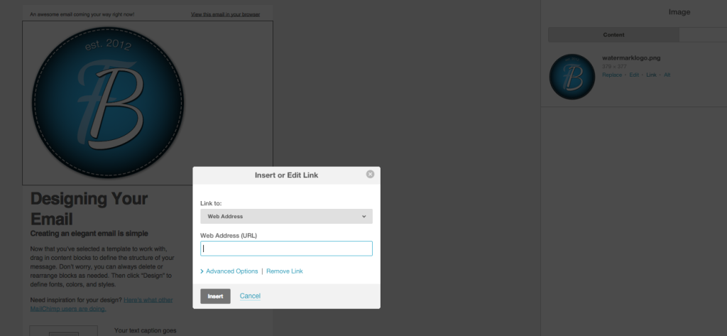
4. Now I’ve clicked on the DESIGNING YOUR EMAIL in the left template area to open up the menu on the right. 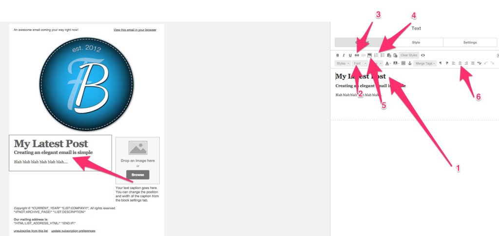
1. This is where I actually type. Then it appears in the template.
2. I can change the font.
3. I can create links.
4. I can make bulleted lists.
5. I can add an image if I want (which is slightly different than creating an image element).
6. I can align my text. Remember, if you click on Style or Settings, you’ll get more options!
Now I’m going to add my picture with a little about caption. If you want to import an image from a blog post or social profile, it’s easy.
Click on the element on the template (1). Then click upload (2). You’ll see the option that says IMPORT FROM URL (3). 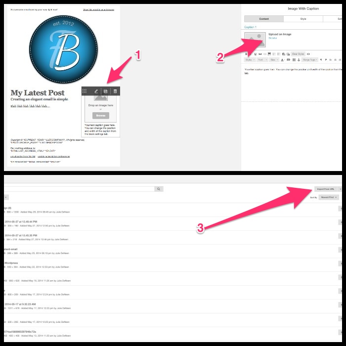
Next, I added a button so people know exactly where to click if they want to keep reading. You can put the whole post in the email, or just a portion. I spent most of my time in the style section for the button to customize the color and font. If I clicked on content, I could put whatever URL I wanted the button to take people to. 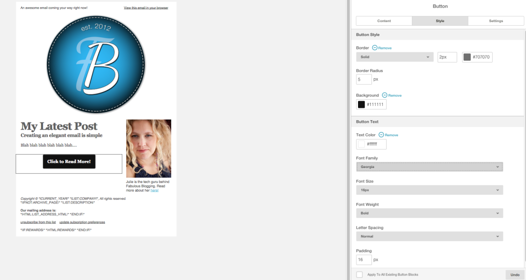
Then you can add dividers before the footer, social buttons, images in the sidebar, whatever you wish! Here’s my final look….
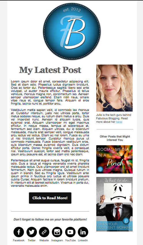
When you’re finished, hit save and exit. Then you can name your template!
Sign Up Form Customization
So you have a list, you know how to send a campaign, and you’ve created a template. The other critical piece to MailChimp is creating sign up forms! Go back to the dashboard and click on LISTS. Then click on the list you want to work with. You’ll see the sign up forms option on the top menu. These are the two I’m going to focus on. 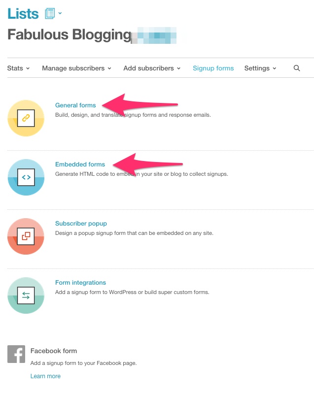
General Forms
These forms are separate pages that can be linked from anywhere. Click on the SELECT button to choose the General Forms option. 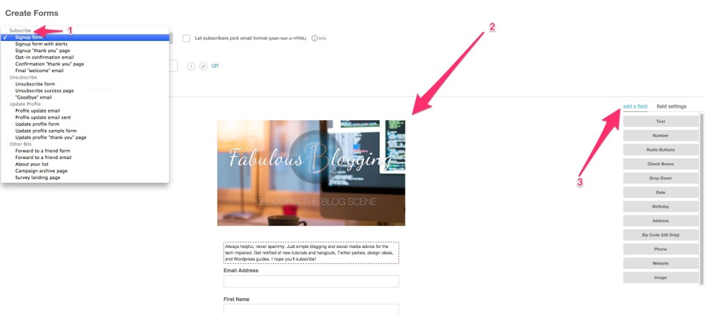
-The subscribe forms (1) and emails are the ones you mainly want to customize.
-Sign up form is the main form you see below in screenshot (2).
-Sign up with alerts is what happens if they type something wrong in the form.
-Sign up thank you page is where they go once they’ve signed up.
-Opt-in email is the confirmation email you can customize that’s sent to them once they sign up.
-Confirmation thank you page is what happens when they click on the link in the opt-in email.
-Final welcome email is an option you must turn on (I don’t).
(3) These are the field settings you can click and drag into the form (2) to customize it.
Choose the Sign Up Form from the drop down to start. You’ll notice you have the option for Build It, Design It, and Translate It.
-Build It is where you edit the labels, add images, etc. Click right on the form and you’ll see where the field settings were (3) changes each time you click on a part of the form.
-Design It is where you can change colors, fonts, and colors.
-Translate It has options I rarely change. Just leave the defaults. Once the form is done, you’ll see on the top of the screen there is an EEP URL. This is the unique URL to this sign up form page. If you copy and paste it into your browser, you’ll see how your form looks.
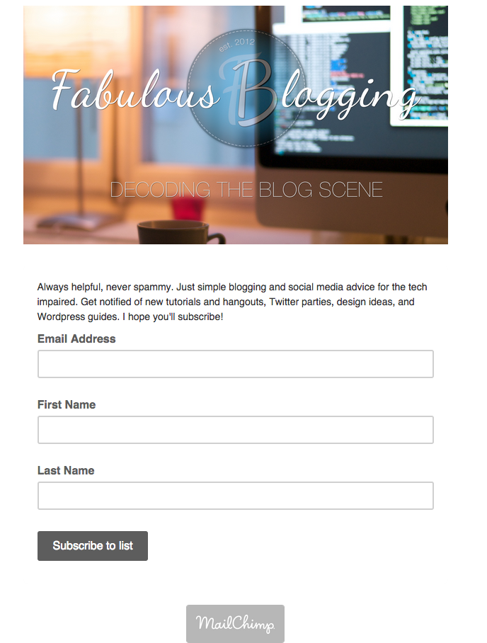
You can use this URL as a link in blog posts, on subscribe buttons, or if you want to make a subscribe image that links to the page. I made this button on Last Mom. It’s an image created in Photoshop and linked to her sign up form.
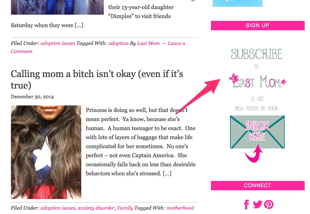
Once you’ve done one form, you can continue on with the others.
A couple things to note:
-If you want your thank you page to go to a specific spot on your blog, you have the option of adding a URL instead of customizing the form. This is a great way to send people to content you want shared.
-If you get to know MailChimp’s Merge Tags, you can customize your opt-in email so it’s uniquely you.
-Remember when we talked about groups? You’d see your groups available as fields to add to your form if you set them as public. -You can customize your sign up form with your own header, fonts, etc.
Embedded Forms
Embedded forms are a bit trickier because they require CSS in order to make look good. If you go back to the sign up forms option, click SELECT on the embedded forms. 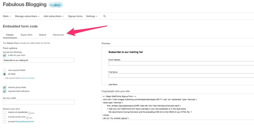
-Classic is just a first name, last name, email address option.
-Super slim just asks for the email address.
-Naked is what you choose when you want no styling (because you will use CSS to style)
-Advanced gives you options for CSS styling.
With the classic and super slim, you can change the title and width, but that’s about it. You’ll see the code below the sign up form. That’s what you can put in a text widget or hook box on your blog. If you want to try your hand at CSS styling your embedded form, the following tutorial may help.
Tips & Tricks You May Not Know
1. Do you want to create a free piece of content to offer people when they sign up for your emails? I wrote a whole tutorial on how to add files to MailChimp that you can then link in welcome emails.
2. You have an image editor built right into the MailChimp interface. Click on any image in your template. Click edit and a whole host of options will appear, including enhancing, cropping, and resizing.
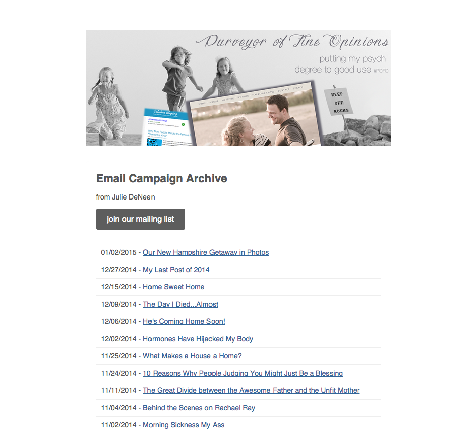
3. If your campaigns are public, you can view the archives, and even tweet out links. Every campaign is given a unique URL. To find it, click on CAMPAIGNS, then click on DETAILS and click the blue link that says Campaign Archives.  Once you click on it, the email will come up in the browser and in the top left you can click on PAST ISSUES. You’ll see all your campaigns, plus the option to to subscribe. Share this on social media to entice new subscribers.
4. I like to embed my whole personal blog posts in a MailChimp email. So I use the code option to copy and paste the HTML right into a simple template.
5. Did I forget a question? Email me at Julie@fabulousblogging.com or tweet me at @fabblogging and I’ll do a follow up post for MailChimp FAQ!
