Font principles
The difference between a serif and sans-serif font
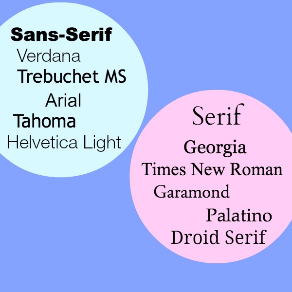
A serif font is one with little feet on the ends of the letters. A sans-serif font is straight up and down with no extra twirls or twists on the end. If you pick up a book at the library, the text will most likely be a serif font like Times New Roman or Georgia. However for online reading, sans-serif fonts are preferred for body copy. You’ll notice if you Google something, the search results are all in a basic Arial sans-serif font. If you want your website to have the feel of manuscript or book, you can use serif fonts. Otherwise, stick with sans-serif for the main body of your text.
Various fonts don’t display on all browsers or devices
If you have your website looking gorgeous on your 27inch brand new lightening fast Mac, great. You realize though that there are millions of people using old computers with the dreaded Internet Explorer? Many of the latest and greatest fonts will not even appear on these systems, so wherever you have important text (like copy, sidebar headings, and primary navigation), make sure you use a common font. If you absolutely can’t bear to, select a fall back font in the event that the browser doesn’t render it the way you designed it. You can’t go wrong with this list. 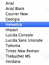
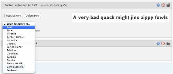
Fonts increase the load time on your site
One of the most popular font sites, Google Webfonts, will show you how much extra load time a custom font will add to your website. For this reason, you should stick to 2 custom fonts at most! Now for those of you saying that stifles creativity,just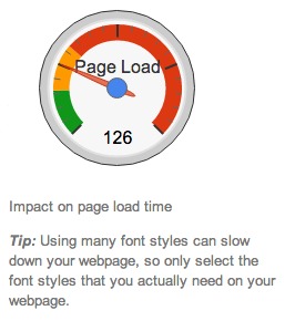 hang on a second. You can use custom fonts for things like logos, headers, or headings — if they are images. If you are creating design elements in PicMonkey, Canva, or Photoshop, these will load onto your site as an image, not as text. Assuming you optimize your images for your site, you can customize to your heart’s desire. Text is typically used in the menu bar, post titles, body copy, widget headings, and widget text.
Don’t pick two fonts that are closely related
This is a general principle of font design that will help you stay on track. If you try to combine two serif fonts together, they’ll compete for your eye’s attention and create conflict. Another thing to look for is the shape of the “O”. If you have one font with a round O and the other with an oval, this will cause your eye to be confused. The same goes for the space between the characters. If they are close but not exact, this will confuse you. Choose two fonts that are distinct from one another, but evoke the same mood.
Choose “roles” for your fonts
This means if you decide to use sans-serif for the menu bar, use that same font for your headings. Then pick a serif font for your body copy and meta info in your footer or at the bottom of your website. Keep your site consistent.
Readability is the most important part of font choice!
Save your favorite swirls and twirls for a logo. Everything to do with titles, navigation, and reading needs to be crystal clear — both with typeface, size, and color. For more font combination principles, check out this great article called 29 principles for making great font combinations. 
Finding fonts to use for design
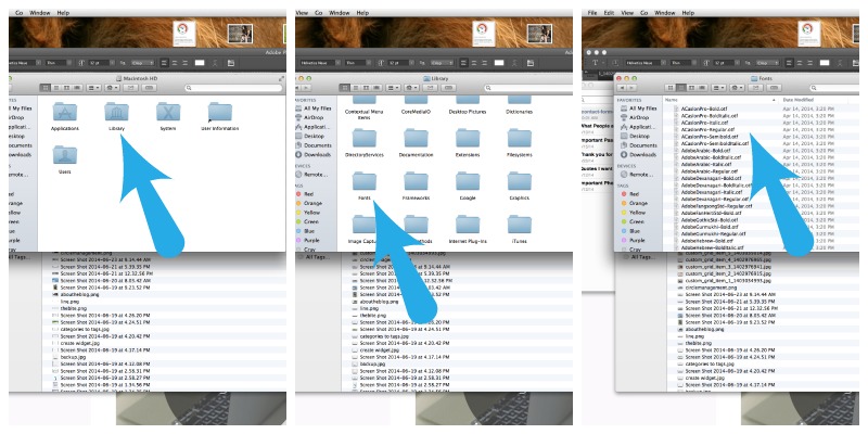
Here is a list of some of my favorite spots for finding fonts. Remember that you can often find a free version of a font you like, but it’s usually licensed for non-commercial use. If you are a business, you’ll need to buy the professional version. Once you have a font you like, you simply download it onto your computer and add it to your font library. I’m exclusively a MAC person so here’s a screenshot of my font folder. *Did you know that the latest version of PicMonkey will allow you to use your custom fonts when creating an image? If you don’t have Photoshop, try using PicMonkey (the royal version) and you’ll be able to use any font in your computer’s library.*
>> Font Squirrel
>> Da Font
>> My Fonts
Another great place to find fonts to use is Pinterest. I have a font board where I pin any free custom fonts I come across! 
Finding fonts to use on your site as TEXT
The best place to get a font to use on your site is Google Webfonts. These are super easy to install, even if you theme doesn’t have a specific spot. If you use Prophoto or Genesis with the Dynamik website builder, the Google webfonts come already built in. Otherwise, you’ll have to install them onto your site using this method.
1. Pick out a font.
2. Click ADD to collection.
3. When you’re ready to install it, click on the button that says USE in the bottom righthand corner.
4. Click on the tab that says @import. Copy and paste that code into the stylesheet of your theme.
5. Once you’ve done that, you’re ready to make an element on your page in the font of choice. 6. Click and copy the code in step 4 on Google webfonts and replace it in the stylesheet under the element you want to change.
It stands to note that there are multiple ways to install fonts, and this article goes into more depth about modifying your php files to make the custom font load more quickly than using the @import method. 
A list of common elements
Each theme for WordPress is slightly different, but here is a general list of the types of elements you might want to change. I’ve organized them into two categories – simple and decorative. You’ll want to stick to basic fonts for simple, and if you want to use a decorative font, save it for the few I’ve listed below.
SIMPLE
- Post Titles – This is the title of a blog post
- Page Titles – This is the title of a page
- Top and/or Bottom Meta Info – This is where your date, author, categories and tags go
- Post Content – This is the content of your blog post
- Page Content – This is the content of a static page
- Headings 1, 2, 3, 4, 5, 6 – These are six predefined font styles to use within your post
- BlockQuote – This is a special formatting for when you want to indent a quote
- Comments Header – The comment header section
- Comments – This is the primary content in the comments area
- Sidebar Widget Text – This is any text in sidebar widgets
- Footer Text – This is any text in footer widgets
- Primary Navigation – Your main menu bar tabs
- Secondary Navigation – If you have a secondary menu, this is what it’s called
- Breadcrumbs – Breadcrumbs are like a trail, showing you where you are at in the site (i.e. Home > Category > Post)
- Links – Anywhere you have a hyperlink in your content (your theme will have several link elements, for sidebars, footers, content, etc.)
- Unordered Lists – Whenever you use the bullet or numbered list button in the post screen
DECORATIVE
- Sidebar Widget Heading – The titles of your widgets
- Footer Heading – The titles of your widgets in your footer
- Header – This is often an image, but you can use text.
- Tagline – This is often an image, but you can use text.
- Headings (you could make one heading more decorative) – Sometimes I customize one heading to be decorative, and the rest to be simple.
Fonts evoke a mood, even if you don’t mean to
Just look at this example of a logo design for a restaurant called Lobster Landing. I put the title in PicMonkey and played around with my custom fonts. I can instantly make the restaurant seem like…
A kid friendly place  A quick bite stop on the docks
 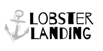 A casual pub
 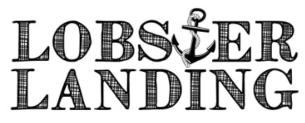 A city restaurant
  A stately spot in an elegant town
 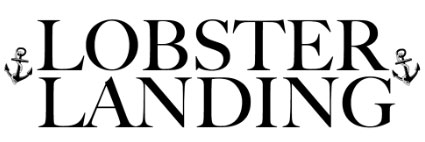 Choose your fonts carefully because you may send a message you don’t intend!
Test your fonts in different sizes, weights, and styles
Once you have a staple font you like, test it the following ways…
ALL CAPS
Bold
Italic
Underline
Lighter
Heavier
It’s possible if you’re using a custom font for your body copy — it may not bold or italicize the way you want it to. This is why I recommend using the most common fonts for the main text on your site. 
I found a font on a site that I like, but I don’t know what the name is!
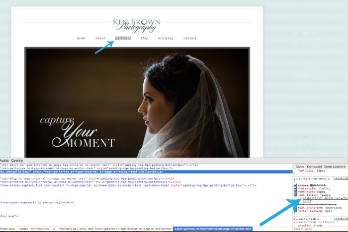
If you use Chrome (or the Firebug extension on Firefox), you can easily check the font type of any WordPress website. Simply right click and choose INSPECT ELEMENT. A box full of code will come up, and you’re looking for the name in the bottom right. In this case, I discovered that the menu tab is in Baskerville.
 Simplicity is always the best way to go if you aren’t sure. Choose one or two fonts. Keep your main text in a straight forward sans-serif font (unless you want your look and feel to be more like a book). Design a custom header or logo using a fancier font in PicMonkey or Photoshop. This will ensure your logo displays correctly on all browsers, and that you aren’t putting excessive burden on the load time of your site. If you love fonts, consider making custom images with text overlay and sprinkling them throughout your posts and pages. Canva is a great program for this sort of tinkering. Most of all, have fun!
GoDaddy Managed WordPress is built from the ground up for maximum performance, security and ease of use. Click here to experience the difference.
