1. Customizing the footer to say exactly what you want it to.
Depending on what theme you use, you’ll have a footer at the bottom that may or may not include the theme name, a generic copyright, and a log in for the WordPress admin console (they are all a bit different). Here’s what my footer looked like when I first installed Dynamik.
Here’s what it looks like now.
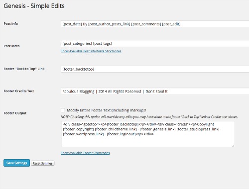
Add whatever copyright or disclosure policy you’d like, pay tribute to your designer or theme, and you can also add an email or phone number, plus something that shows you’ve personalized your site down to the very bottom. If you are running on the Genesis Framework, you can download a plugin called Genesis Simple Edits and this will allow you to customize the footer.
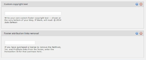
In Prophoto, the customize option is under Prophoto > Customize > Sidebars and Footer. They require you to pay an attribution removal fee if you want to get rid of their link. Otherwise, you can add whatever you’d like in the custom copyright footer text.
2. Custom divider lines in your posts.
When you are writing a post, have a custom designed image that reflects your color style and theme to break up big chunks of text. I use the Fab Blogging logo with a blue line and it gives my posts a more professional look, not to mention – more readability. You can easily make custom divider lines in Design Tips Using PicMonkey That You Might Not Know About! or Canva. Then add it to your post through the Add Media button. 
3. Share buttons automatically grabbing the correct Twitter handle.
Jetpack is a backpack of plugins that help bring functionality to your site. One of the modules, called SHARING, allows to add the most common share buttons at the bottom of your posts. If you go into Settings > Sharing, you’ll see a spot for your Twitter handle. Paste it in and that way people don’t have to guess what your name is on Twitter! 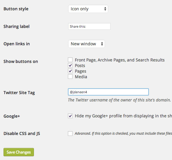

4. Filling out the tagline field in General settings
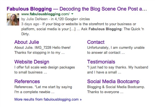
As soon as you’ve installed WordPress, fill out the first two fields on the settings page. These are what shows up in Google search results.
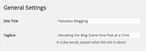
5. Completing a user profile for every author on the blog, including a bio, photo, and relevant platforms.
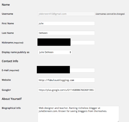
For every user profile, you have a few customizations that are simply for your benefit. For example, you can choose to show the black toolbar at the top when you are logged in. Some people turn that off because they like to see the site the way visitors are seeing it. You can customize your dashboard, and then you should fill out everything you can.
You’ll notice there is no spot to have a photo. This is because you need to customize your avatar through WordPress.com. When you have the SAME email address connected to your website as to your avatar account, the profile picture will automatically come up. This is confusing for some people, and the reason I wrote about how to get your avatar working properly.
6. Creating a custom 404 page.
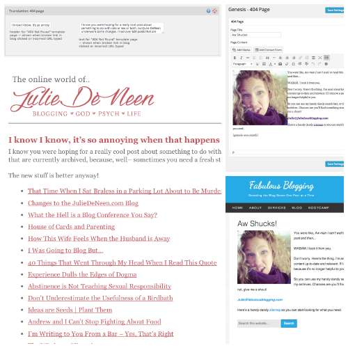
A custom 404 page ensures that if people click on a link that is broken or expired, they will stay on your page because the “not found” message is customized to look like your site. If you are running a blog or content marketing plan, you’ll have a website accumulating a lot of pages. A 404 page is a must for those bad links you don’t have control over. If you are running Genesis, simply download the 404 plugin and you’ll be able to add custom text, photos, a search bar, and some archives. In Prophoto, you can go to Customize > Advanced > Translation and write in the code. If you don’t know HTML, you can follow this trick to get the look you want.
7. Creating a custom signature.
Do you have a multi-author site? If so, having a signature at the bottom is very helpful. Even if you are a one person show, a signature adds customization and functionality, not to mention, the option to remind your readers to follow you on social media or subscribe to your website. You can add custom code to a hook area in your Genesis theme, or if you are nervous about code, try the Genesis Club Lite plugin. It’ll make creating a signature a snap! Some themes have what’s called an “After Post” widget, and you can add any code or gadget you want. For Prophoto, you simply need to go to Customize > Advanced > Custom Code > Signature. Here are a few signatures that look very nice. 
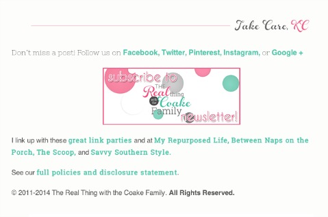

8. Having an HTML sitemap for visitors.
A sitemap is a great tool for your SEO, but typically a sitemap is a simply xml file that’s made easy to read by robots. Your visitors might appreciate a sitemap that outlines all the various pages and categories on your site as well. If you are running Genesis, simply create a page called SITEMAP and choose the page template to say Archive. If you aren’t on Genesis, you can use the Jetpack shortcodes module and create an index page by using the shortcode [[archives]]. 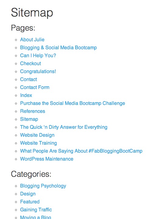

9. Creating custom categories so that it doesn’t say “uncategorized” on your posts.
When you post something on your blog and don’t bother to categorize it, it will go into an “uncategorized” category. The first thing you can do is change that so it says something more custom to your site. To do this, click on Posts > Categories, and click edit on the uncategorized option. You’ll notice you can’t delete it? Simply change it to say something like “General Information”. That way, if you forget to categorize a post, you at least don’t see that default uncategorized option. 

10. Creating a custom subscribe box for your email list sign up.
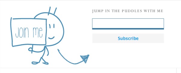
If you are using MailChimp or aWeber for your email sign up, you have all sorts of options for customizing your embedded sign up boxes. I have two tutorials I use; one for mailchimp and one for those on aweber. A custom email sign up looks professional, not to mention you can customize it to fit whatever widget area you’re trying to fit it into.
11. Uploading a favicon onto your site.
A favicon is a small image that appears on the browser tab when a visitor is on your site. It’ll also show up in an RSS reader. To create a favicon, first create an image that is 16×16. This is very small, so it’s better to start with a large square (200×200) and when it’s finished, scale it down. You can then save it as a jpg. Once that’s done, you can use a Favicon generator and turn it into an .ico file. Or, you can just append the suffix of the file to say .ico. Once you have the file, you can either upload into your theme (through specific theme settings) or you can log into your server and upload it via FTP.
12. Change your permalink structure so it’s not set to default (be careful, this should be done ahead of time).
Changing permalink structure after the fact is easy in theory, but can be disastrous on your backlinks. When you first install WordPress, the structure looks like this for each post…  Change it to month and day or year, month, and day, as soon as possible.
13. Make sure you have every social media platform you use, including an RSS button as well as an email address. If you have a contact form, still add the email address. Make sure it is linked.
Social media buttons should be in several places. First and foremost, you want to create (or buy) buttons that go with your theme. You can place them in the top of your header, in the menu bar, or at the top of your sidebar. Some bloggers also add social follow buttons at the bottom of each post. Make sure to include an RSS button as well, especially if your feed URL isn’t a standard URL type address. And as always, provide BOTH a contact form and an email address for people to reach you. Notice the various positions of these social media buttons? They are all right at the top and to the right.
14. Create a custom menu that links to various categories of posts.
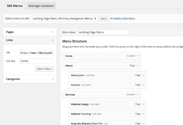
The default for WordPress is to simply auto-populate a menu whenever you add a new static page. But menus can do so much more, include linking to a specific spot on a page or post, linking to various tagged posts and categories, or taking your readers to an outside link. If you’re not sure what kind of menu you want right away, create an about page and a contact page. Link them on the menu bar, and add a HOME button by using the link box option. Every single website needs a HOME button and an ABOUT button on their menu bar.
15. Use Featured Images
Featured images are a great way to ensure that one particular image in your post will be displayed when people share your content, pin it, or when looking at excerpt versions of your post. To add a featured image, click the blue link on the bottom (right) of the WordPress edit screen and add an image to that box. If you want the image to be IN the post, you’ll have to add it again. You’ll notice when you share links via Facebook and other social platforms, the featured image will display. If you don’t have one, it may not grab a photo at all (or it will grab the first image in the post). 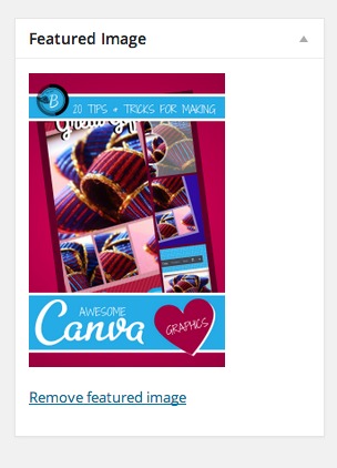

16. Streamline your fonts and pre formatted heading styles.
When you write a post, WordPress has six pre-defined heading styles built in. Depending on your theme, these headings may be different sizes, weights, etc. (they are rarely different colors). If you want a custom look, you’ll need to edit your CSS to define each heading. For this blog, I’ve customized a lighter version of my body font to be used as my headings. Example…
Heading 1
Heading 2
Heading 3
Heading 4
Heading 5
Heading 6
17. Customize your blockquote.
The quotations tool in the edit screen allows you to indent and format text that you want to stand out. Your theme will have a default style for the blockquote, but CSS can help you further customize it so the colors, border, and style match the look you are going for. The tweet below is in my custom blockquote.
Make your WordPress site stand out with these 20 Tips! Tweet
18. A search bar needs to be at the top and/or bottom of every page.
No matter how organized your menu bar or navigation, every single website on the Internet needs a search bar. Preferably several if you are a DIY blog or someone who writes a lot of practical content. Put one in your menu bar, at the top of your screen, in your sidebar, and in your footer.
19. There shouldn’t be one page that doesn’t link to your sign up form in some way.
Similar to a search bar, your email sign up form should be visible at all times. It’s common to have it in a sidebar, but put it on your About and Contact pages as well. Another popular place to put a sign up is right at the bottom of each post. If you are really serious, you can use a pop up, but be careful it doesn’t annoy your mobile readers. I have my sign up on my sidebar and at the bottom of every post.
20. A picture of your company staff or yourself should be immediately apparent on the front page with a blurb and a link to read more.
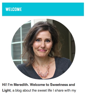
Put a casual but professional headshot of you and/or your company in your sidebar or somewhere above the scroll line on your site (this means people don’t have to scroll in order to see it). Add a short welcome message and make the text and image clickable. This way people can read more about you right away.
21. Customize your links.
When you’ve picked out a color palette for your website, customize all the links so they match. If you love purple and green, make the link color purple. Then make the hover color a darker purple. And finally, you can make the link turn green once the visitor has clicked on it (this term in code is called ‘visited’). Every theme has a different customize screen, and if yours doesn’t, you can always change it in the CSS.
22. Customize the messages that show up above the comment and share icons. Set it to say something personal rather than the standard message.
Instead of saying something generic like “Leave a Comment” try more creative options like,
- Let us know what you think!
- We love comments!
- Discussion is great, do you have any feedback?
- Speak Your Mind
- I Love to Get Comments
With these customizations, your website will sure to be unique to your style and brand. Many of the above ideas don’t take a professional designer to accomplish. You simply need a flexible and dynamic theme that allows you to make the kind of changes you want.
GoDaddy Managed WordPress is built from the ground up for maximum performance, security and ease of use. Click here to experience the difference.
