If you haven’t taken Canva for a test run yet, you should. It’s a fantastic graphic design tool for bloggers who want to create custom photos, newsletters, buttons, and more. There are over 1,000,000 stock images for $1.00 each plus oodles of free elements. You can sign up for an account and have a graphic made and ready in under five minutes.
For those of you who have dabbled in Canva, here are 20 tips you may not have discovered yet.
1. Turning your design into a PDF allows you to create links on any of the elements in the graphic!
Click to see a demonstration of a PDF that links back to my blog
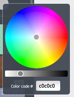
2. Use your specific color codes in the color wheel and Canva will remember that color while you are designing.
You color code will be a six digit number and letter combination with the pound sign in front of it.
3. If you like the texture/pattern of one of the free backgrounds, you can change the color by clicking on the color palette.
I love the free background patterns they offer, but sometimes I want it in a different shade.


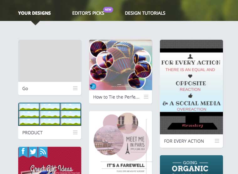
4. You can come back to your designs again and again. Create a template and simply reuse it!
All your designs are saved for future use. You can also provide a friend or colleague with the link so they can edit it as well.
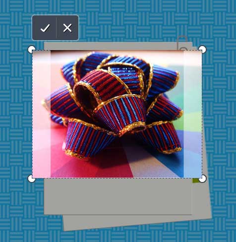
5. If you’re using a frame, double clicking on the image will allow you to move or resize it.
You can click and drag to show just part of the image, or grab the corners and make the photo bigger.
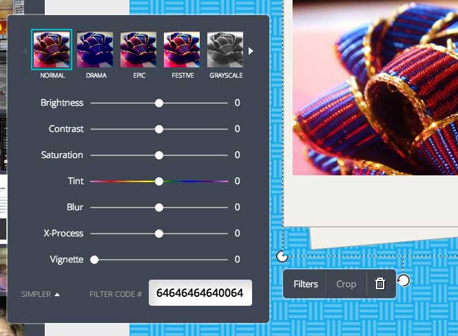
6. Clicking on the filters button (and then choosing advanced) will give you complete control over the look and feel of the photo.
Filter codes can be copied and pasted so you can have all your photos with the exact same setting.
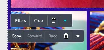
7. The little arrow (when you have a photo selected) will allow you to flip it vertically or horizontally.
The little arrow in blue is the one that will flip flop your photograph.
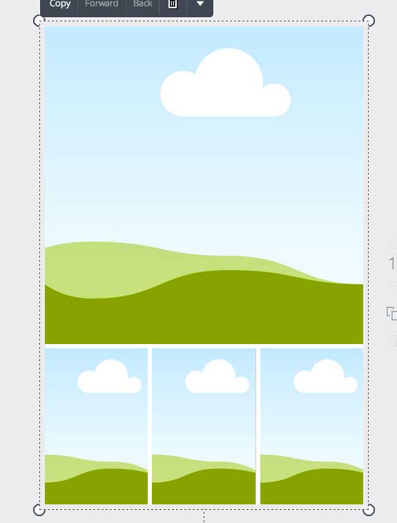
8. Use the GRIDS layout to get your pictures perfectly aligned. Then you can shrink or enlarge it to fit on your page!
This is the original grid layout I chose.
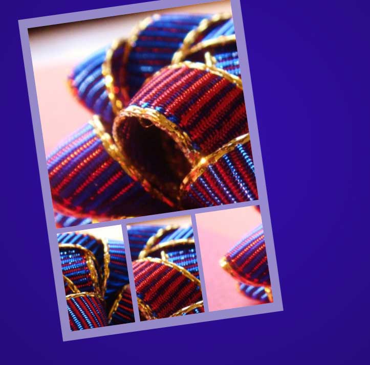
Then I added my photos, shrunk the grid, and tilted it on an angle.
9. Use the generic shapes option to create your own custom frames around your grids.
In the screenshot above, I used a rectangle shape and dragged it around my grid. Then I clicked BACK to send it behind the grid. Finally, I made it white and set the transparency to about 50%. This allows the purple color to bleed through the shape and create another tone of the same purple.
10. When you are trying to line things up, wait until the grid lines appear – telling you that the element is straight or centered.
As you move items around on the page, you should see grid lines showing you how the element is lining up.
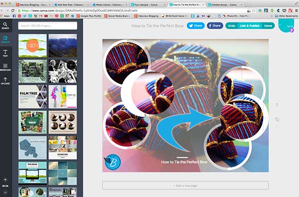
11. If you want to create a shadow on your text, copy the text, make it black, and send it behind the original text. With it selected, use your arrows key to move it slightly behind and down. It’ll create a shadowed look.
I create the white version first, then copy it, change it to black, move it to back, and use the arrow key to get it slightly off-centered.
12. If you click the CHANGE DEFAULTS under the text options, you can save your favorites so they load every time!
This is a great handy tool because there are fonts I love to reuse over and over again.

13. Holding the shift key and selecting different elements will allow you to move them in a group.
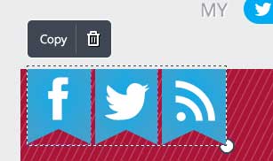
I wanted to move all three buttons at once so I clicked on each one while holding down the shift key. Then I used the arrow keys to move it over exactly where I wanted it to be!
14. Use buttons on your PDF’s to encourage readers to act by clicking on the link.
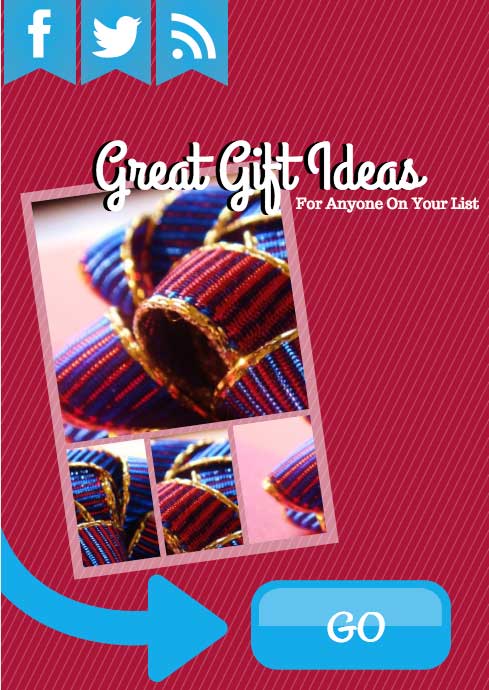
I created a PDF and then put a big GO button to encourage people to click. I also made the Facebook, Twitter, and RSS buttons links. It won’t work here on the blog page because you are looking at an image of the PDF. PDF’s are great for opt-in downloads, email newsletters, and attachments to supplement your blog.
15. When you first open Canva, you can create an image with custom dimensions.
You can create any size you need. Use Canva to create buttons and ads, as well as large scale graphics.
16. Use the same photo in the letter frames to create a cool effect for a collage.
17. Hitting the copy this page will allow you to create a template and re-use it for up to 20 pages.
I’ve used this feature to create similar graphics for an infographic I made about how to manage your social media time.
18. If you like a frame (but don’t want to put a photo in it), first create some generic background canva graphic and save them to your computer. You can then upload them as images and stick them in the frame.
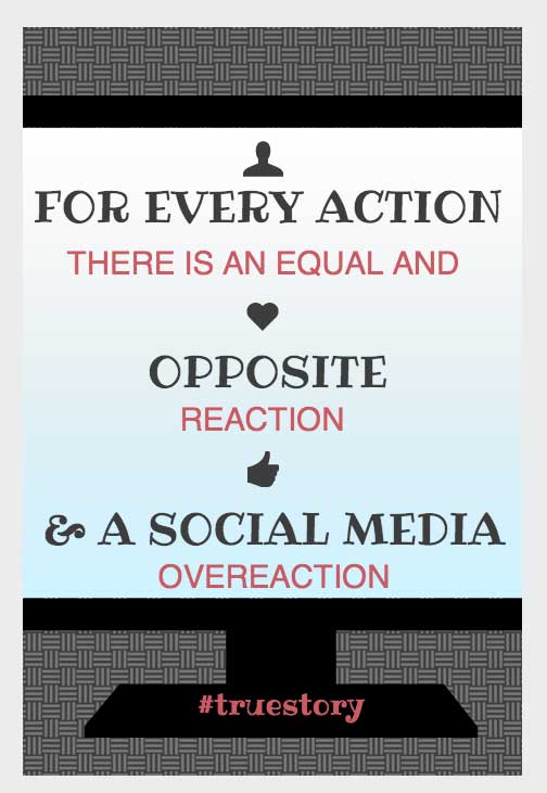
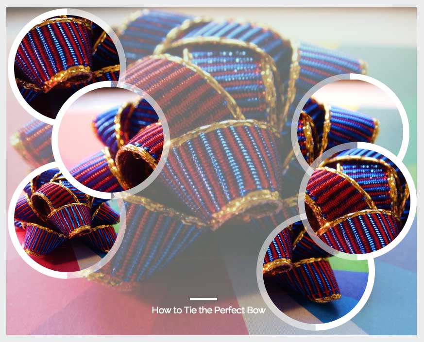
19. Use an image and set the transparency to 60%. Then use the frames to highlight the same image for a neat effect.
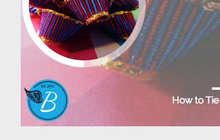
20. If you have a custom watermark or logo, have your designer make you a transparent PNG you can upload into Canva for when you want to watermark your graphics.
I use this B on all my graphics to identify they are mine.
Find me on Twitter at @jdeneen4 and tell me how you are enjoying #Canva graphics!
