 As a web designer/blogger, I am constantly messing with themes and frameworks. If you’ve been around the blog scene for any length of time, you know that Thesis and Genesis are two industry standards. There is also Weaver Pro, a great theme for beginners, or of course- you can trick out any of the WordPress standard themes and be on your way. I have used them all, and will continue to do so.
But more and more, I’m convinced that Prophoto — a WordPress framework originally designed for high-end photographer/bloggers — is now my go-to framework for anyone needing a basic business site or blog. Why you should you consider it, even if you aren’t a photographer.
1. Tech support that knocks the competition out of the park.
When it comes to Prophoto, if you have a question or problem, you get a human response within hours. They are kind, helpful, and go above and beyond. And, if you are the kind that likes video/written tutorials, their site is full of them.
Did you know that right in your Prophoto dashboard are little life vests and information buttons that give you immediate help? Check them out whenever you’re stuck!
2. Automatic updates.
If you don’t like to keep track of the latest version of your WordPress theme (and you should since outdated themes are vulnerable to malware attacks), Prophoto automatically updates when you log in. *The only exception is if you are on a an unknown host server that doesn’t allow that sort of thing.
3. Image displays without plugins.
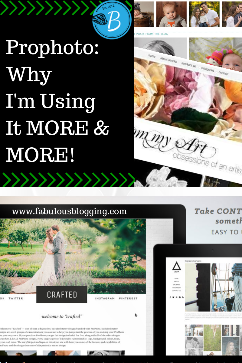
Prophoto has built in lightboxes, which are galleries that have a cool hover effect and pop up window. Prophoto also has built in slideshow functionality, giving you complete control over the look and transitions of your photos. There is also a homepage masthead section that displays full width photos — any size or shape you need.
Some mastheads are displayed below. To see lightboxes/slideshows in action, check out For the Life of Me or Skoda Designs or MJP Studios.


4. Grids.
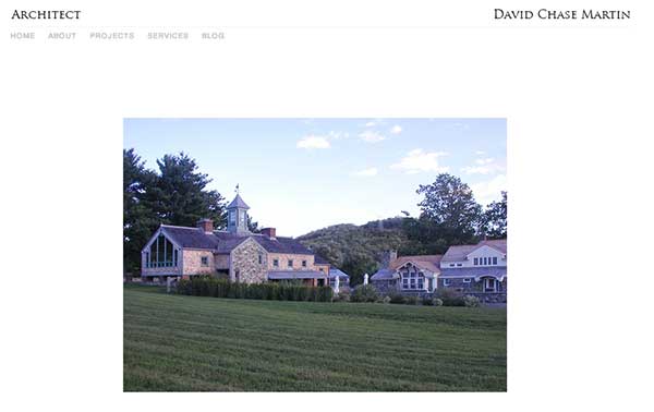
If you are a crafting or food blogger, the built-in grids alone are worth the price of ProPhoto. You can make your site look like an online magazine or Pinterest. Here are a few screenshots of how nice grids look with the content organized.


To see how amazing grids can be, check out DCM architects. You’ll see it mimics Flash without using having to use it! *That site is still under construction.*
5. Mobile optimization.
Again, without a plugin, you can make your site look completely different on mobile devices. It does all the heavy lifting for you, while allowing you to change colors, fonts, and even have a custom masthead and header for your mobile version.
6. No coding…or tons!
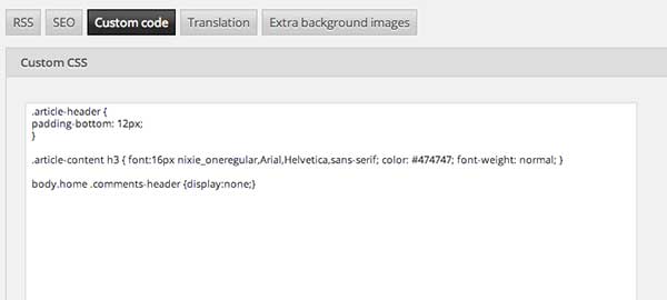
Their biggest selling point is that you can manage your site without CSS. For many of my clients, this is a major perk. How nice to be able to adjust colors and fonts without having to pay a designer right? But the other side of that coin is that many designers need specific CSS rules to display elements just as the client wants them. I regularly use CSS in all my Prophoto designs and can do as much customization as I need– all in one tidy area that does not get overridden during updates.
7. Facebook integration and custom call to action buttons.
I keep repeating myself, but it’s true. A site with tons of plugins is more vulnerable to attack. Prophoto has all the typical plugin features built right in, including social media call to action buttons, like and recommend buttons for Facebook, and Facebook commenting. This builds your exposure, and gives people an easy way to interact with you.

8. Slide out drawers and pages.
If you have a lot of information to display on your homepage and don’t want your sidebar to get cluttered, Prophoto’s signature sliding drawers are perfect. They act as four separate sidebars that automatically appear when a visitor hovers over the tab. And you can easily hide them on specific pages or posts with a bit of CSS code.
In addition, the menu bars on Prophoto allow you to have pages “slide out” rather than navigating to a new page. This is especially handy if you don’t want people to migrate off your landing page too quickly. It has a nice “wow” factor as well.
9. Image protection and watermarks.
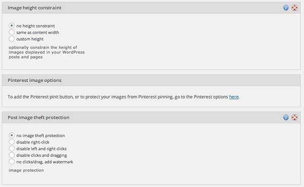
No longer do you have to watermark each individual photo. Just upload a watermark in the designated area and it will do the rest of the work for you. It also allows you to disable the right/left click on your site, or prevent people from pinning.
10. Attention to detail like no one else.
They’ve really thought of everything. There’s a spot for a custom signature, a maintenance wall, a place to put your google analytics code, options for creating buttons and widget images, automatic image resizing, built-in contact form with spam protection, password protected pages, favicon, FB preview image defaults, extra background images, SEO site wide options…shall I keep going?
The price is worth it. It’ll run you about $200.00, but never again will you wrangle with poorly coded themes, too many plugins, or lack of support. As a designer who specializes in teaching people HOW to be their own webmasters, I love to teach Prophoto to clients, I love to design with it, and of course, love to use it.


