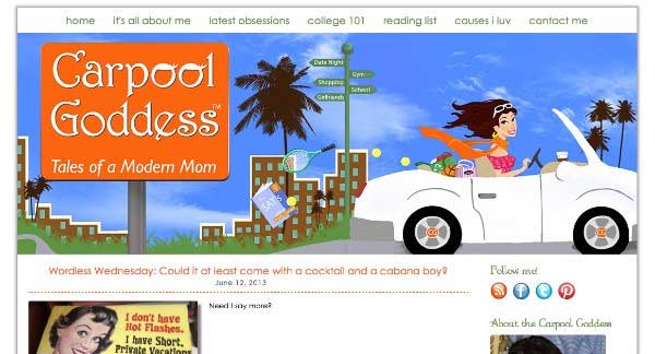
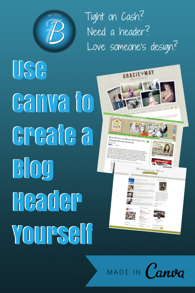
 Your blog header is the first thing someone sees when arriving on your site. It’s a defining image or logo that tells your reader what to expect from you. A header usually includes text, symbol or image/s, and a tag line.
Headers can take up the top 1/3 of a blog or website, or they can be smaller in stature– placed in the top right or lefthand corner. It’s difficult to define exactly what makes a header ‘work’ or not, since beauty is in the image of the beholder. But there are some tried and true principles to help guide you on your quest for header that looks well done.
If you aren’t design savvy, your best bet is to hire someone. But we all know, that’s not always possible. So for the purposes of this post, I’m going to assume you don’t have Photoshop, Illustrator, or Gimp (or the money to hire a professional) so we’ll be using Canva. It’s free, requires no software, and makes designing headache free!
I’ve chosen some professional headers I love, and recreated them in Canva to show how you can get a similar look. It won’t be exact of course, since Photoshop is usually the instrument of choice for professional designers, but if you are tight on cash, doing it in Canva is a great option.
Remember, use other blogs to draw inspiration, but don’t copy them exactly! I redid these headers with the same titles/taglines so as to show the before/after, but it’s important to develop your own unique style!
Simplicity
Over done design is one of the biggest mistakes amateurs make. You can’t go wrong with simple. Rather than trying to force a symbol or image into your header, keep it straight text. You can add a few details to the shape, size, and fonts to help it stand out.
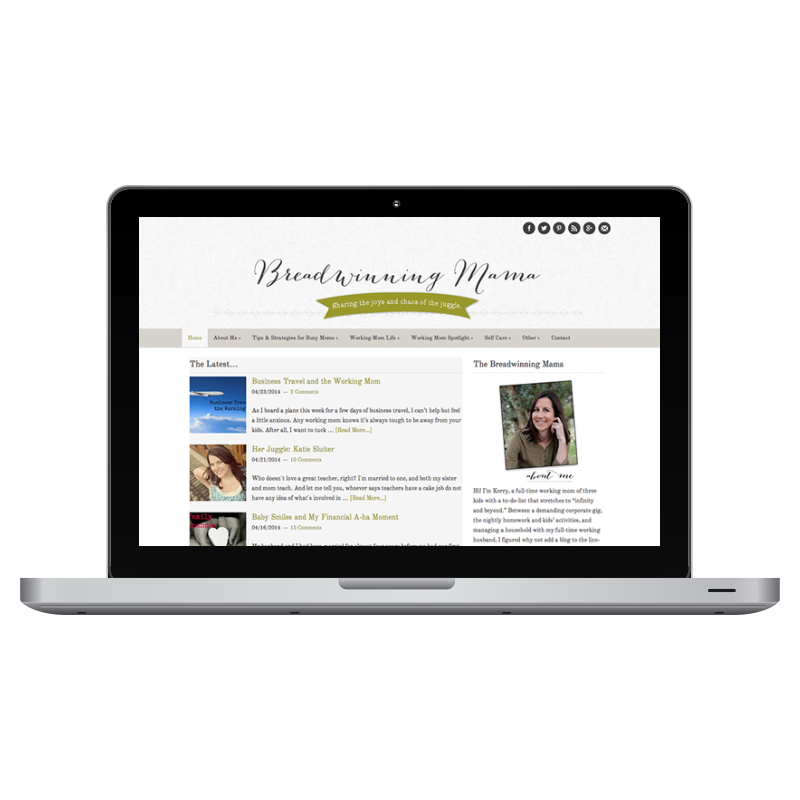
To recreate this yourself:
- Log into Canva and use the Custom Dimension option. Set it to 1000 x 300.
- Click on the banner icon and type in your tagline. Center the banner on the page.
- Then click on the TEXT button and type out your blog title.
- Click on the lines option and pick one out that you like. Drag it onto the canvas and click the MOVE BACK option.
- I made the lines at an angle by turning one, then adding a second, flipping it – and turning it. Then, to hide the parts of the line that were sticking out above the banner, I used a white square to cover it.
Easily Recognizable
Logos aren’t just for brands and businesses. Bloggers can pull off the logo look too. Here is Lisa Leake’s award-winning food blog. She’s got a brand logo on the left, with a traditional blog-like header on the right.
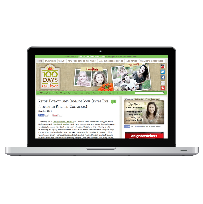
To recreate this yourself:
- Log into Canva and use the Custom Dimension option. Set it to 1000 x 300.
- Choose the background option and pick a texture.
- Adjust the color of the texture.
- Then add some frames and insert pictures into them.
- Click on the Text Frames option and choose the one that says TAPE.
- Drag them onto the screen and change the font, color, size, etc.
- To make the logo on the left, I combined a frame with a box.
- I then added the lines and the text.
- To create the shadow, I copied the text, changed the color, and aligned it just below.
A Visual Feast
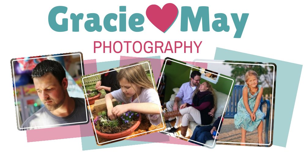
Professional headers are visual. They capture a feeling with one look. This award-winning photography blogger has combined both the elements of simplicity (in her text logo), plus a symbol (the heart), and then adds a beautiful photo collage.
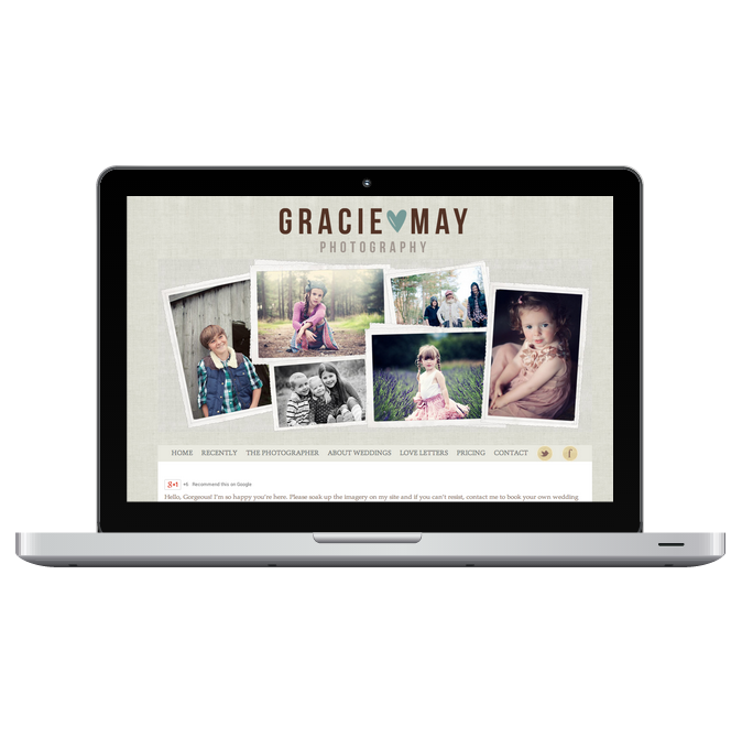
To recreate this yourself:
- Log into Canva and use the Custom Dimension option. Set it to 1000 x 500.
- Choose a font for your title.
- Adjust the colors, size, etc. and pick a symbol for the middle of the title.
- Then add some frames and insert pictures into them.
- Grab some colored shapes if you want and place them behind the frames for a more layered look.
- Don’t be afraid of things looking asymmetrical!
Here are some other ideas to help you design your header…
- Use a drop shadow on your font by doubling up the text and placing one behind the other. It helps make it pop.
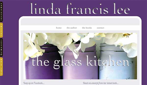
This header has an inner drop shadow (it was done in Photoshop). - Try out a combination of colors and fonts. See if you can play with the wording so it’s not completely linear. Consider changing the font of a letter or two. With text, you have color, spacing, style, and layout. Use them ALL to your advantage.
- Menu bars at the top of the page can help a site feel more airy and open. Using a menu bar with no color also adds to the light style.
- Have your header have a *half transparent, half white background. This way, it looks like the header is spilling into the content. Natalie’s header is transparent for 2/3 of the space, allowing the background to come through. The bottom portion is white, and when it butts up against the content background, it looks more 3D. You need a theme that allows you to control the margins. *In order to do this, you’d first have to create a graphic in Canva, and then pull it into PicMonkey where you can set a transparency for the background.
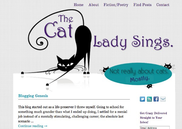
You can’t tell where the header ends and content begins. (Done in Photoshop, but could be pulled off in PicMonkey if you’re good!). - If you are using a header image, design it the exact size your theme requires. Stretched out images look terribly unprofessional.
- Your background will make or break your header. If you can use subtle textures, that is better than a flat color (usually- there are no hard and fast rules).
- If you don’t have a nice photo or logo to use, go with straight text. It’s better than working in something cheesy just to have a header. Look around on other websites. You’d be surprised how many go with plain text {This site is a perfect example!}
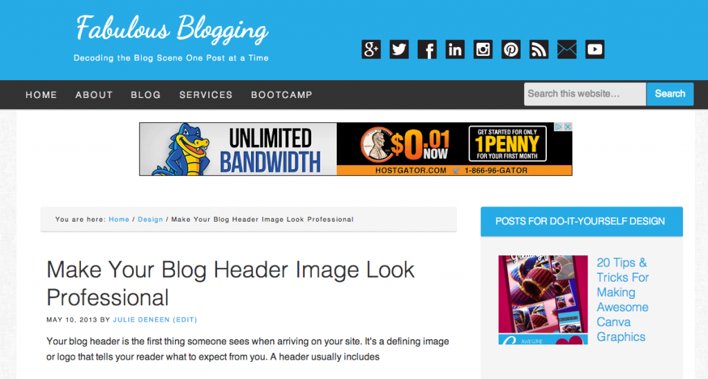
I’ve moved away from the giant header for my business site (this is dynamic text on the Genesis framework). - Be careful with collages of photos. In some cases they can look nice, but it’s very easy to go from classy to too cutesy and “scrapbooky”.
- Keep your tagline short!
- Browse Pinterest and type LOGOS into the search bar. You’ll see all kinds of ideas to mimic!


